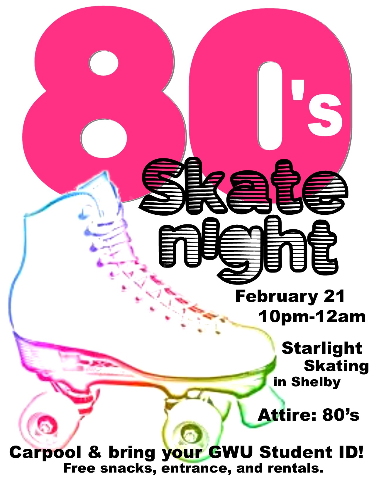
For my Document Design Project, I chose to work with Haley Pond of Gardner-Webb University Student Activities to create an informational, but effective, flyer for the upcoming 80’s Skate Night. Located in Shelby, North Carolina at Starlight Skating, the event will last the duration of two hours (10 p.m. to midnight) and offer students free entrance, skate rentals, and food. While I wanted to include all of the preceding information, I did not want this flyer to have the “typical look.” All too many times have I stumbled across a black-and-white poster for something meant to be bright and exciting. I did not want this to be the case when it came to this particular project, especially since this flyer is being geared towards the student population of GWU.
Check out the final product!:

Designed by Liv LuVisi for GWU Student Activities.
Originally, I had planned to create the majority of the flyer in Adobe Photoshop CS4. I began by locating an image – I did not want a typical roller skate, so I browsed Google Images until I discovered the outline of a skate done up in rainbow-colored fashion (http://radleymarx.com/blog/rollerskate/). I really liked the feel of this image for multiple reasons: not only did it portray the bright, fun atmosphere of the event, but it was also ecofriendly and would help lower printing costs (less ink to print).
After I had dragged the skate image into Photoshop, I quickly realized Photoshop was not the program I wanted to primarily work in. Although I have practiced a great deal in CS4, I realized that most of that “practice” consisted of editing pictures (brightening, enhancing, color adjustment, etc.). I was not too familiar, nor comfortable, with the idea of manipulating text and images to create a layout. With this in mind, I created a Microsoft Publisher file and inserted my rainbow skate image. I knew I wanted it to be a focal point, so I enlarged the image and kept it flush with the left side of the page in the bottom corner. To make the colors pop just a little bit more, I used Publisher’s simple “Corrections” function to apply a 50% brightness/60% contrast effect.
I knew I wanted to emphasize the theme of the skate night, but I didn’t want it to overpower the entire page. Using WordArt, I typed “80” in Bauhaus 93 font. I selected a bright pink color found in the rainbow skate image and filled the entirety of the text, adding a slight shadow to give the text some depth. I was aware that this was the 80’s Skate Night, but I was conscious that had I typed “80’s” into WordArt, the text would not appear “locked” on the top of the page (due to the “s” being much smaller than the numbers). Instead, I chose to make a separate WordArt in Arial Bold font. I removed the shadow, filled the text with white, and positioned it over the 0. This allowed the alignment of my numbers to remain the same while still conveying the appropriate event name.
Keeping the principles of Robin Williams’ CRAP in mind, I liked the idea of the text expanding just short of halfway down the page, with the top corner of the skate overlapping. I felt this would create a “bond” between text and image, rather than appearing as two separate elements of design. However, I ran into an issue. The skate was on a white background, and rather than the corner protruding into the pink 8, it was a white box.
I reopened the skate image in Photoshop. By duplicating the layer, I was able to use the Magic Wand tool to select the skate itself. I deleted the white background, allowing a transparent layer underneath to shine through. It was trial and error, not all of the pixels having been removed. Using my Eraser function, I touched up the edges, resaved the file, and reopened it in Publisher. I added the previous brightness/contrast function as a finishing touch. Now, when I moved the skate image to overlap the text, it was a smooth point rather than a bulky box.
I wanted to use a separate font to highlight “skate night” to add some typographic contrast. However, after browsing through Publisher’s preset options, I wasn’t satisfied. I had downloaded free, personal-use fonts on dafont.com back in high school, so I decided to see what I could find. I searched through a couple of categories, before I found one labeled “Groovy.” (This was definitely an adjective I would use to describe the 1980s!) Before long, I stumbled across a gem by the name of “Eighties Shades.” It instantly reminded me of shutter shades, those strange sunglasses with the lines going across that were popular during the decade’s hottest fashions. I downloaded the font and added it to my computer’s “Font” folder in order to get it to appear in all Microsoft programs.
Back in my Publisher document, I created two textboxes: one for “skate” and the second for “night,” positioning them one just slightly above the other. Because the font was see-through, I kept with the theme of overlapping by letting “skate” rest on top of the 8 and 0. The bright pink shone through, giving it that extra shutter shade feel.
Last, I knew I needed to get the pertinent information in somewhere – what good was a flyer if it didn’t tell you (at least) the what, when, and where? I was drawn to the shape of the skate, and the idea of wrapping the text around it seemed intriguing. I began making individual textboxes, filling each with a piece of information from the date to the time and location, all in Arial Bold font. Rather than make each piece a different color of my neon rainbow, I chose to stick with black to retain a professional feel.
Upon examining my final piece, I consciously checked off what had typically been subconscious during the creative process: contrast in font and colors, repetition in size, alignment around the page, proximity between important pieces of information, the overall shape (from the skate to the text around it), to the choice of font and style.
Looking back at the comments on my Peer Review sheets, Jon states that the flyer “immediately grabs my attention and makes me want to go to this event; this flyer makes the event look fun.” Erin also took note of the font and colors, stating that “the fonts contrast well with each other” and “the bright colors are gorgeous and eye-catching. It really fits the theme of the 80s.”
What do YOU think?
A big thank you goes out to:
Microsoft Publisher
Adobe Photoshop CS4
Dafont.com
Radley Marx’s blog for the photo!
Haley Pond for the idea!