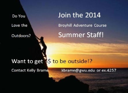
I thought I would try something a little new this time. Now that I’ve been in this class for nearly a month, I feel like a switch in my brain has been flipped into the “ON” position. Let’s call it the Redesign Switch, because every time I see something that is poorly made, I want to go fix it!
After receiving this week’s Paw Prints, I was just browsing the e-newsletter to see what cool events Student Activities have planned for the upcoming months – yes, I am one of those people who actually read their emails – when I saw it. Not because it was beautifully designed, but because I saw so much potential. What it could be.
With my Redesign Switch on, a little extra caffeine, and some basic Microsoft Publisher action, I created this:
WAH-LAH!
…and yet, I still feel like it could use some work. Opinions? What do you all think?


I think that because of this class we will never see design the same again, which is a good thing. I read my e-mails too so don’t feel bad.I really like your design way better. It gives the viewer a since of reality. The one before that seemed to inspirational or something when the point of the design is just to get people to join the staff. I like the way that you organized the text, it gets the viewer’s attention but doesnt take away from the photo. Good work.
Well written. May peace be with you 🙂
I agree with Dennis. I prefer your design. It is effective in the fact that all the information is clear, and it also helps give a clear idea as to what the Broyhill Adventure Course is. The original with the rock climber near the ocean is misleading.
I’m more of the type of designer that has to play around with ideas to see what I think works and what doesn’t, but have you considered rounding out the corners of the text box? The eye-catching parts are very bold and “blocky” (my brain has currently forgotten the real word for it), perhaps it would provide some contrast? That’s the only thing I can think of at the moment.
I hope you shared this with Kelly Brame. So much cleaner and effective. I love that you did this.